Button Themes
Pro feature
Button themes require Commandeck Pro. The free tier is locked to the Bold theme.
Button themes change the visual style of every tile in the grid. Select a theme from Preferences → Button Appearance → Button theme.
Available themes
There are six themes. Bold and Neon keep each button's own color; Cards, Phone keys, Retro and Tron apply a uniform style and ignore per-button colors.
Bold (default)
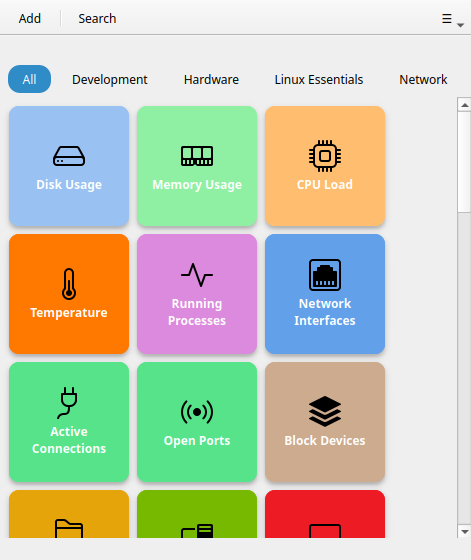
Solid colored tiles with strong contrast — your per-button background color as a flat fill with bold white text. The system default; works well in both light and dark mode.
Cards
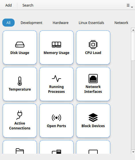
Light card-style tiles with a soft accent-tinted border. Clean and neutral — a good choice if the Bold colors feel too strong.
Phone keys
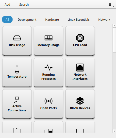
Compact, rounded keys with a soft shadow, reminiscent of a phone dialer or calculator. Works best with small or medium button size.
Neon
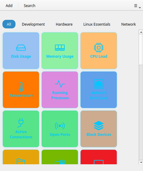
Each button's own color on black: a glowing border and halo in the button's color, with cyan text. Brightens on hover. Dark-mode friendly.
Note
Neon's halo is best appreciated at runtime — hovering a button brightens its border.
Tron
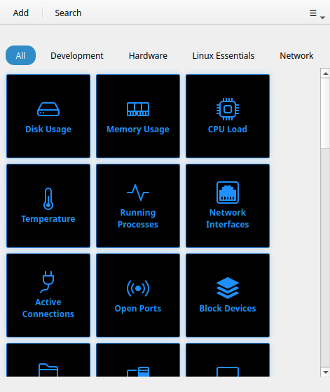
Black tiles with bright cyan outlines and text — a grid-runner look. Ignores per-button colors; every tile shares the same neon-on-black style.
Retro
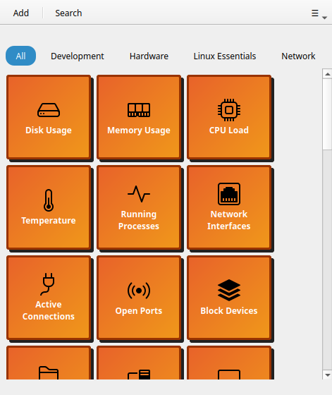
Amber monochrome with a hard offset border, terminal-inspired. Ignores per-button colors — all tiles look the same intentionally.
Custom CSS
Computer only
Custom CSS is computer-only. The Android app has the six themes above, with a light, dark or system appearance.
Pro feature
Custom CSS requires Commandeck Pro.
For full visual control, load your own stylesheet file. Set the path in Preferences → Button Appearance → Custom CSS file → Browse. Commandeck uses Qt Style Sheets (QSS) — a CSS-like syntax, but with Qt's own selectors and a smaller property set than web CSS.
When a custom stylesheet is loaded, it is applied on top of the selected theme. You can combine a base theme with small overrides, or write a complete theme from scratch.
Available targets
A button is a QFrame named ButtonTile containing a QLabel named TileLabel. Its
states (running, success, error, selected) are exposed as dynamic properties you match
with [property="value"] selectors:
/* The tile container */
QFrame#ButtonTile {
  background: #1e1e2e;
  border-radius: 12px;
  border: 2px solid rgba(255, 255, 255, 0.15);
}

/* Hover state */
QFrame#ButtonTile:hover {
  border-color: rgba(137, 180, 250, 0.8);
}

/* Pressed state */
QFrame#ButtonTile:pressed {
  background: #181825;
}

/* The label text */
QFrame#ButtonTile QLabel#TileLabel {
  color: #cdd6f4;
  font-weight: bold;
  font-size: 13px;
}

/* Running state (command is executing) */
QFrame#ButtonTile[running="true"] {
  background: #313244;
}

/* Success flash */
QFrame#ButtonTile[success="true"] {
  border-color: #a6e3a1;
}

/* Failure flash */
QFrame#ButtonTile[error="true"] {
  border-color: #f38ba8;
}

/* Selected (multi-select) */
QFrame#ButtonTile[selected="true"] {
  border-color: #89b4fa;
}
Click Export template in Preferences to download a starter file containing all available selectors with their default values commented out.
Note
Qt Style Sheets are not web CSS: there is no transform, box-shadow, opacity
transition, rem unit, or max-width/max-height. Use solid colors, borders, and
border-radius; size with pixel values.